UX Design for Startups: The Complete Guide for Founders (2026)
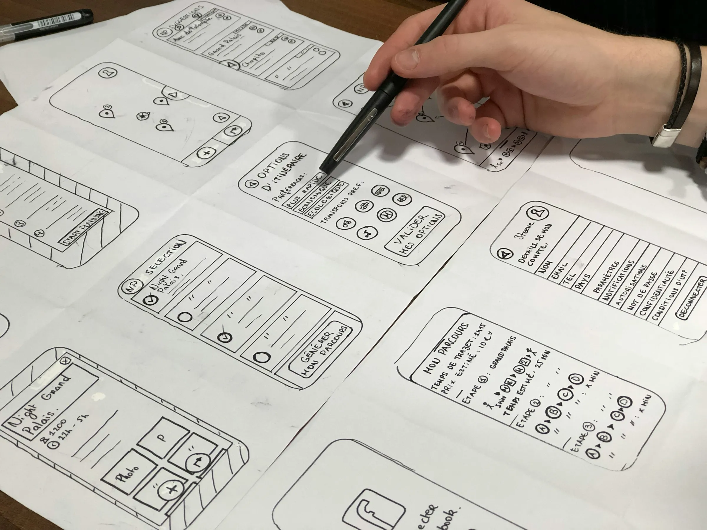
UX design for startups means spending design effort only where it moves the next milestone: proving people want the product at pre-seed, getting new users to value fast at seed, and making the product scale without falling apart at Series A. Founders can do the early research and rough flows themselves, but complex products (dashboards, permissions, developer tools, money movement) usually need senior design help sooner than teams expect. The rest of this guide shows what that looks like, stage by stage.
Most startups do not fail because a button is the wrong color. They fail because the first ten customers could not figure out how to get value on their own, and nobody noticed until churn showed up in the board deck. Good startup UX is mostly about catching that early and cheaply.
Who is this guide for?
Founders, first product managers and engineering leads at B2B SaaS startups from pre-seed to Series A, especially in cloud, DevOps, cybersecurity, AI and fintech. You have a product, or a prototype, and you are deciding how much design to do yourself, when to hire, and what to skip for now.
It is also the hub for our UX for startups series. Each section links to a deeper article on that topic.
What UX work matters at each startup stage?
| Stage | Main UX job | Do it yourself | Bring in help for | Safe to skip for now |
|---|---|---|---|---|
| Pre-seed | Prove the problem and a usable first workflow | Interviews, sketches, clickable prototype | A complex MVP (data-heavy, multi-role, technical users) | Design system, brand polish, edge-case settings |
| Seed | Get new users to value without help | Watching sessions, reading support tickets | Onboarding, core dashboard, research with real customers | Full redesign, pixel-perfect marketing pages |
| Series A | Scale the product and the team | Prioritizing which flows to fix | Design system, permissions, information architecture, first design hire | Redesigns that do not touch activation or retention |
Pre-seed: prove the problem, not the polish
At pre-seed the design job is narrow. You need a prototype good enough to run customer conversations and an MVP that does one job well. Spend your effort on the one workflow that proves value, and sketch the rest on paper. The exception is a product whose value lives in a complex interface, such as an observability tool or a security console. There, a rough UI makes the product look like it does not work, and early senior help pays for itself.
Seed: fix the path to first value
Seed is when real users show up without you on the call. The big UX question becomes activation: does a new account reach the moment where the product clicks? This is also when UX debt starts to slow growth, as features get bolted on without a shared pattern.
Series A: build the foundations
After Series A the product and the team both grow. Inconsistency becomes expensive, roles and permissions get real, and enterprise buyers start asking about audit trails and SSO. This is the stage for a design system, a clear information architecture and, usually, a first in-house design lead working alongside a partner.
What should founders do themselves and what should they hire for?
Do yourself anything that depends on your judgment of the market: talking to customers, deciding which problem to solve first, and writing down what "done" means for a flow. Nobody outside the company can do that for you.
Hire for anything where experience compresses time: complex interaction design, data visualization, design systems and the states nobody thinks about until engineering asks (empty, loading, error, partial permissions). A senior designer has solved those before, and you have not.
If you are deciding between an agency, a freelancer or a first hire, we compared them in UX agency vs freelancer vs in-house by SaaS stage, and we published an honest shortlist of the best UX design agencies for B2B SaaS startups.
How do you run user research on a startup budget?

You do not need a research team. You need a habit. A practical setup for a startup:
- Five interviews per question. Nielsen Norman Group's long-standing guidance is that testing with about five users finds most of the usability problems in a design. Run small rounds often instead of one big study.
- Mine what you already have. Support tickets, sales call notes, churn reasons and session recordings are free research. Read them every week.
- Ask about the last time, not the future. "Walk me through the last time you investigated an alert" gets real behavior. "Would you use this?" gets politeness.
- Write one sentence per finding. If the team cannot remember it, it did not happen.
For B2B products, where your user and your buyer are often different people, talk to both. We go deeper in UX research for complex B2B products.
What makes MVP UX convert?
An MVP converts when a new user can do the one valuable thing without asking you how. In practice:
- One clear job on the first screen. If the home view offers seven equal options, nobody picks one.
- Real data, or realistic sample data. An empty dashboard says nothing. A sample workspace shows what the product will look like with their data in it.
- Empty states that teach. Every empty table should say what goes there and offer the action that fills it.
- Errors in plain language. "Connection failed: check that the API key has read access" beats "Error 403".
Before and after, a quick example. Before: a monitoring MVP opens on a blank dashboard with a "Create widget" button. After: it opens on a guided "Connect your first service" step, then shows a prefilled dashboard with the three metrics most teams check first. Same features, a very different first five minutes.
How do you design onboarding that leads to activation?
Start by defining activation as a specific action, not a feeling: "created a project and invited a teammate", or "connected a data source and saw the first result". Then remove every step between sign-up and that action that is not strictly required. Ask for information when you need it, not up front.
For B2B products, plan for two journeys: the admin who sets things up and the end user who arrives later through an invite. Both need a path to first value. The patterns that work are in why most SaaS products fail at onboarding.
When should a startup build a design system?
Not on day one. Build one when you see the same component designed three different ways, when more than one designer or several front-end engineers touch the UI, or when screens take longer to build than to design. For most B2B startups that is late seed or Series A.
Start small: tokens for color, type and spacing, then the ten components you use everywhere (buttons, inputs, tables, modals, tabs, toasts). Document states, not only looks. We cover the order of operations in design systems for fast-growing startups.
Which UX metrics should a startup track?
Track a few metrics that connect design to the business, and review them every month:
| Metric | What it tells you | When it matters most |
|---|---|---|
| Activation rate | Share of new accounts that reach the first-value action | Seed onward |
| Time to value | How long that takes | Seed onward |
| Task success rate | Whether users complete key tasks without help | Any stage, in tests |
| Support tickets per active account | Where the interface confuses people | Seed onward |
| Retention by cohort | Whether value lasts after the first week | Series A |
The full list, and how to avoid vanity numbers, is in UX metrics that actually matter. If you need to make the business case for design work, start with how better UX reduces churn and increases activation.
What are the most common startup UX mistakes?
- Designing the happy path only. The product looks great in the demo and breaks on the first empty state, slow query or missing permission.
- Copying consumer patterns into expert tools. Technical users want density, keyboard shortcuts and bulk actions, not a wizard for everything.
- Redesigning instead of fixing. A new look rarely moves activation. Fixing the three steps where people drop off usually does.
- No one owns the whole experience. Every feature team ships its own pattern, and six months later the product feels like five products.
- Waiting too long for senior help. By the time UX debt shows up in churn, fixing it competes with everything else on the roadmap.
How does startup UX change by vertical?
Fintech
Money moves in one direction. The critical screens are the ones where a single tap cannot be undone, so confirmation, previews and recovery windows matter more than anywhere else. Read fintech UX for actions users can't undo.
Cybersecurity
Security tools are dense, noisy and used under pressure. The two problems that show up first are alerts nobody trusts and permission models nobody understands. See alert fatigue UX, RBAC UX for permissions people understand and human-centered design in cybersecurity products.
DevOps and developer tools
Developers judge a tool in minutes, often from the CLI or the docs before the UI. Time to first deploy or first successful API call is your activation metric. Our notes on the UX pitfalls of DevOps platforms cover the usual traps.
AI products
AI features need to show what they did, why, and how to undo it. The hard part is deciding when the system acts alone and when it asks a person. See AI agent UX and human-in-the-loop controls and explainable AI UX.
Across all of these, the dashboard is usually the screen that makes or breaks the product. Our UX principles for complex SaaS dashboards apply to every vertical.
What is the next step?
If your product is early and the path is clear, use this guide as a checklist and do the research yourself. If your product is complex and the team is moving faster than design can keep up, that is the point where a specialized partner pays off. delbueno™ Studio does product design for B2B SaaS teams in cloud, DevOps, security, AI and fintech, with kickoff the same day and first concepts within 48 hours. If you want an outside view first, request a free UX audit of your current product.
Frequently asked questions
When should a startup hire its first designer?
Most B2B startups benefit from a full-time designer after product and market are clear, often around Series A. Before that, a founder with product sense plus a freelancer or a specialized agency covers the work with less risk. Products with complex interfaces need senior design help earlier.
How much UX research does an MVP need?
Enough to answer the one question that could kill the product. Five conversations with the right users per question, plus a weekly read of support tickets and session recordings, is a realistic start for a small team.
Do startups need a design system?
Not at first. Start with a small set of tokens and core components once the same patterns repeat and more than one person builds UI, usually late seed or Series A. A full system before then tends to freeze a product that should still be changing.
What is the most important UX metric for an early-stage SaaS?
Activation rate, defined as the share of new accounts that complete a specific first-value action. It connects design changes directly to revenue and is simple enough to track from the first customer.
Can founders do UX design themselves?
Yes, for interviews, sketches, prototypes and simple flows. Bring in experienced help for complex interaction design, data-heavy dashboards, permissions and design systems, where mistakes are expensive to undo later.
Photos by Amélie Mourichon and Vitaly Gariev on Unsplash.